Data Visualization As an Act of Witnessing

Photo Courtesy of the Undocumented Migration Project and Jason De Leon.
The Undocumented Migration Project pop-up installation, “Hostile Terrain,” visualizes the humanitarian crisis on the United States’ Southern Border
By Mary Aviles
In late 2016, I read an article by Michael Brennan, principal of Detroit-based, nonprofit design firm Civilla, in the Harvard Business Review. I was haunted by this line:
“I cannot recollect, in 30 years of work, a single PowerPoint presentation I saw or gave that altered the course of anything.”
I am a qualitative researcher and strategist. It is my job to talk to people. Over the years, I’ve spoken with all types of people: school cafeteria workers to women who lost pregnancies late in their terms. When this exploration goes well, what happens is termed “developing empathy.” In other words, I get a tiny sense of what it’s like to walk in another person’s shoes. The challenge is what happens next. I have to transmit that new understanding to the rest of the project team, most of whom have not been as “in the weeds” with the participants. We call this “socializing the research insights,” and no matter how integrated and cross-functional the project team, somewhere along the way, in order to achieve alignment or obtain buy-in, other people will need to be persuaded, but the farther away they are from the participant, the harder it is to pass that same degree of empathy along to them. Over the years, I have experimented with a variety of approaches, relying on video, audio, verbatim excerpts, photography, PowerPoint, and data visualization.

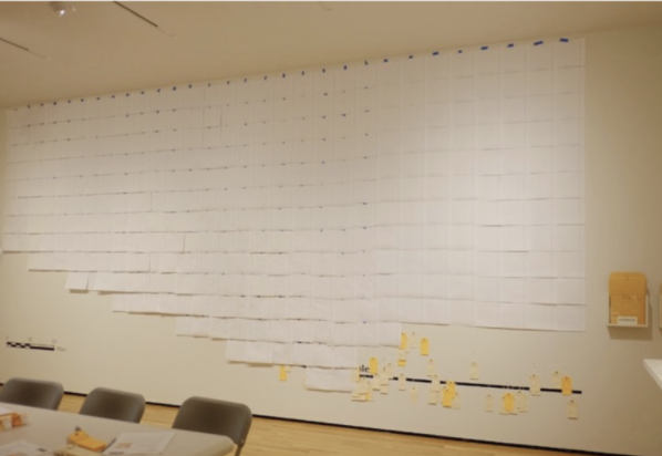
HT94 Prototype Exhibition at the Penn Museum — Photo credit: Maria Murad
Recently, I have encountered examples of physical visualization — data presented as an interactive exhibit — that inspire my client work. These installations make aspects of the intangible, tangible — something you can touch and experience in real life. In my work with nonprofits, I have become an advocate for data fluency, encouraging community-focused clients to exercise agency and control their own narratives by learning the language of data. To illustrate the potential for visualizing data to inspire empathy, consider the Undocumented Migration Project.
Their Hostile Terrain installation will occur in 150 locations worldwide this fall, timed to coincide with the US Presidential Election. The exhibit is a map of the Arizona border with Mexico. Data were collected between 1999–2019 and the resulting visualization blends ethnography, archaeology, visual anthropology, and forensic science methodologies. Color-coded toe tags are placed to precisely mark the remains of people who died attempting migration. Orange tags represent unidentified remains and manilla tags represent the bodies of those who have been identified. Volunteers at participating organizations will write in the details of the deceased on each tag and hang them. The project describes its interpretive goals as:
Raising awareness of the human toll extracted by the United States’ current Prevention Through Deterrence Border Control policy.
Memorializing the dead.
Developing an installation that can be accessibly replicated in multiple locations to ensure community participation.
Amplifying local programming, reflective of local immigration issues.

Detail of Toe Tag Wall (Phillips Museum of Art, Franklin & Marshall College). Source: Undocumented Migration Project
The power of this visualization is its simple design and stark symbolism. Toe tags, typically associated with the sterility of a morgue are juxtaposed with handwritten details. It would have been logistically more efficient for the team to print the details digitally on each set of toe tags. But, this way, each life represented will be considered 150 times by volunteers as their details are hand printed. As the exhibit’s executive director, Jason De Leon explained, “In the first prototype, we took GIS data and made a giant sticker graphic using red dots to show migrant death. That visualization, where the red dots represented a person, just didn’t have the impact. So, in the second version, we swapped out the dots for the handwritten toe tags. Students did the handwriting. They shared that it was emotionally difficult for them. I wanted to put names to the dead. This is an act of witnessing. The data come from a Microsoft database. We’re asking volunteers to breathe life into the data by writing out the details. That was the closest way we could think of to get someone to feel the human cost. I’ve filled out hundreds of toe tags. It doesn’t get any easier.”
Concentrating on a specific geography, the Sonoran desert of Arizona, serves both an instructive and a functional purpose. The map quantifies the degree to which the migration deterrent policy has failed by humanitarian standards. The stacked tags from ~3,200 bodies recovered produces an inescapable emotional and physical reaction — a palpable reality. And, limiting the geography allows for a practical installation package that makes replication in 150 locations by non-data scientists possible. There were other reasons influencing the choice of geography. De Leon explained, “I knew it the best and it was the only place where we have data that fine grained. If we’d tried to also map other geographies, the wall visualization would have been unmanageable.” An additional benefit of this focused perspective is that it may pique curiosity about other border geographies; curiosity has been identified as foundational to developing empathy and changing personal perspective.

Photo Courtesy of the Undocumented Migration Project and Jason De Leon. Scale drawing of installation. The small triangles on this grid would be replaced with hanging manila and orange toe-tags.
Left: Photo Courtesy of the Undocumented Migration project and Jason De Leon via Instagram. Exhibit under construction at the AD&A Museum and the History of Art & Architecture at UC Santa Barbara. Right: Volunteers Installing the Wall at the Phillips Museum of Art, Franklin & Marshall College — Source: Undocumented Migration Project

I particularly admire the exhibit’s replicability. It can be cost and resource prohibitive to develop and install custom visualizations. The Undocumented Migration Project cleverly addresses this limitation with grid sheets inspired by archeology sites. Additionally, their material selection signifies thoughtfulness regarding affordability, capping the necessary investment for partner organizations at $2,070 and providing partners with fundraising support if necessary. De Leon shared that — in light of its subject matter — accessibility is a foundational value for Hostile Terrain 94, “I had done previous exhibition work that was prohibitively expensive, costing upwards of $20,000 to install … I wanted this to be something that anyone could host.” In addition to being financially accessible, the exhibit is intellectually and emotionally accessible. Though it’s the product of interdisciplinary academic training, De Leon says the goal was for the meaning to be “very accessible so people working in policy can easily digest it.” No matter the medium, this is the key measure of a data visualization’s success.

Photo Courtesy of the Undocumented Migration Project and Jason De Leon via Instagram.
Finally, I appreciate the potential for this installation to amplify local partner programming around their own immigration context. For De Leon, “Success is in seeing our installation partners take ownership. The radical differences in their installation events will show it works — doing something unique in their communities.” In Detroit, I am working with several nonprofit organizations to achieve a complete and accurate count of historically undercounted populations for the 2020 Census. Many of these organizations are also supporting communities experiencing immigration crisis, including one group that was collecting gifts for 150 families whose children had one or both parents facing deportation this past holiday season. No PowerPoint presentation could as compellingly convey the feeling of helplessness I experienced looking at those presents and what they meant for the children receiving them. Visualizations like the Hostile Terrain 94 installation have the potential to move us to meaningful action and inspire systemic change.
Visit the Undocumented Migration Project support page to lend your support to their work.
Listen to podcast episode 183 of Armchair Expert to hear more from Jason De Leon.
This article first appeared in Nightingale, The Journal of the Data Visualization Society.